
CAN-ASC-2.1 Outdoor spaces - Draft
5. Site planning
Information
Table of contents
Note: This Clause provides a high-level picture of the design and technical aspects required for any type of development being proposed regardless of size and scope. Reflecting best practices in universal design, urban design, and site planning, these principles support the main goal of creating accessible developments that provide access to people of all ages and abilities, while also ensuring developments are compatible with their surrounding areas and contribute to the economic, social, and environmental vitality of the outdoor space.
5.1 Design principles applicable to all outdoor spaces
5.1.1 General
In the built environment, all elements of a site or facility should be accessible to the greatest extent possible, taking into account the broadest range of human abilities and ensuring a true accessible journey, linking each of these elements where possible.
It is also recommended from a macro-planning perspective that sites be developed or modified in a manner that achieves harmony between recreation expectations and the environment. The goal is to present a diverse spectrum of activity and recreation setting opportunities, ranging from highly developed to rustic/primitive, from which people can choose with the expectation of achieving specific recreation experiences.
Notes:
- As an example, a highly developed visitor centre with paved parking lots and trails would not be undertaken in rustic/primitive settings, just as rustic outhouses are not typically found in more developed settings. Similarly, a person can expect to encounter less evidence of other people and expect fewer facilities and supports in more rustic/primitive settings.
- It is recognized that accessibility might be challenging in outdoor environments with steep slopes or ecological sensitivity. Careful consideration and a thorough assessment will enable accessibility to such challenging environments.
Clause 1.2 lists the five high-level design principles that should be considered during the planning process for sites of all sizes, shapes, and locations. Clauses 5.1.2 to 5.1.6 outline a list of key criteria under each of these design principles to provide additional clarity.
5.1.2 Context
Context provides an understanding of how the siting and design of spaces and/or buildings within an existing natural and/or built environment work together with the social, cultural, and economic aspects of the people who use the site to help create a space that is usable for all.
Key criteria for context include the following:
- Where appropriate, designs of spaces shall consider form, massing, and density to ensure designs of areas, structures, facilities, and buildings provide accessible spaces that integrate well within the subject site and do not have a negative impact on surrounding sites.
Note: Massing refers to the bringing together of objects and buildings into a mass, and how the building environment looks in terms of basic masses. - Sites, buildings, and structures shall provide entrances and openings along street/open space/walkway/trail edges that are convenient and safe for all users, particularly those persons with disabilities.
- Site entrances shall face the public street, if applicable, and be connected to a sidewalk, car parking area, play space, etc., with direct, well-defined, and accessible pedestrian connections for people of all ages and abilities.
- Entrances to sites and buildings shall be easily recognizable to all users and, where applicable, well-coordinated with adjacent pedestrian/cycling routes, adjacent parking facilities, and public transit.
- Developments should be designed to take advantage of the site’s characteristics, including its proportion, topography, aspect, and geographic location to ensure the site is accessible to as many users as possible.
- Sites, buildings, and structures should be designed to mitigate against increases in wind, runoff, shadowing, glare, and noise, as well as reduced air quality and loss of privacy, to minimize their negative effects and impact on users.
5.1.3 Identity
Identity refers to the character of a space and how it comes from the way the landform, vegetation, buildings, streets, infrastructure, and other aspects of the space combine with the history, culture, and users to influence how people experience, interact, and use the space.
Key criteria for identity include the following:
- The width and number of driveway entrances into a site shall be minimized to ensure the lowest amount of disruption to a public sidewalk as possible.
- All sidewalks crossing a driveway shall be maintained in level, colour, and materiality to ensure the highest level of comfort and safety for pedestrians.
- Vehicle turning radius at intersections shall be kept to a minimum.
Notes:- The turning radius of a vehicle is the radius of the smallest circular turn that the vehicle is capable of making.
- This helps to slow down turning vehicles and provide shorter crossing distances for pedestrians.
- Spaces, structures, or buildings shall be compatible in their scale, proportion, architectural treatment, and relationship to adjacent heritage sites, and shall be designed to improve the accessibility of the site without negatively impacting surrounding sites.
- The existing character within and around all sites should be retained and strengthened while providing accessible spaces.
5.1.4 User experience
The full range of human diversity with respect to a person’s ability, language, culture, gender, age, and other forms of human difference shall be fully considered in the design of the space.
Key criteria for user experience include the following:
- All facilities shall be designed to accommodate as many modes of travel (e.g., walking, wheeling) as possible. Information should be provided about the type of surfaces and location of rest areas for the user to make the appropriate decision.
- Sites shall be safe and convenient for all users, no matter their ability.
- A well-defined and comfortable pedestrian circulation system shall be created to provide direct connections to public sidewalks, transit stops, parks, site features and amenities, and adjacent development. This system shall include the following basic elements:
- be designed from a Universal Design perspective (i.e., fully accessible to all ages and abilities);
- be separated from vehicular traffic with adequate space for landscaping;
- be designed with CPTED in mind to eliminate isolated areas or the feeling of entrapment; and
Note: CPTED refers to Crime Prevention Through Environmental Design, a multi-disciplinary approach of crime prevention that uses urban and architectural design and the management of built and natural environments. - provide clear sightlines for pedestrians and vehicles (see Clauses 6.6 and 6.9).
Pedestrian drop-off areas shall be located and designed to provide convenient and safe connections to accessible entrances and other key areas of interest. Depending on their design, spaces should provide regularly occurring rest areas to offer respite for users.
5.1.5 Movement
5.1.5.1 General
Movement refers to how a successful space offers a complete accessible journey within the space for all users by providing connectivity within and around the space itself and to other nearby spaces, destinations, places, and communities.
Key criteria for movement include the following:
- For parks and green spaces, significant consideration shall be given to accessibility to park services, amenities, and circulation routes.
- Site features (e.g., seating, benches, viewing areas, picnic and day use areas, playground equipment) shall be connected by accessible routes. Routes should be direct and logical, taking into consideration how a person would access each feature and circulate around the site.
- Decision points shall be designed so that the user can determine which path or trail is the most suitable for their ability.
Note: Decision points refer to points along a path or trail where the user can decide which direction to take. - Access to services and site amenities shall be provided to all users. Direct and independent access to site services and amenities should be prioritized.
- Lighting shall be designed in such a way that it enhances accessibility and complies with Clause 6.8.
- All pathways and trails shall be designed to accommodate as many types of users as possible (see Clause 8). Information should be provided about the type of surfaces and location of rest areas to help the user make the appropriate decision.
- Pedestrian trails and walkways should be designed to provide clear sightlines that ensure personal safety (see Clause 6.6 and Clause 6.9).
- All users should have equal opportunities and choice to independently circulate throughout the site by walking or wheeling to experience outdoor spaces, facilities, programs, and services within the site and to any surrounding sites where applicable.
- Accessible seating locations should have clear sightlines (see Clause 6.6).
- Where guardrails, handrails, or fences separate viewing areas from performance areas, care should be taken to ensure sightlines are appropriate (see Clause 6.9).
- Landscaping and vegetation should be planned to not block sightlines, sight triangles, signage, or direct and safe pedestrian movement.
- Landscaping and vegetation should be planned to not encroach on accessible surfaces or create safety issues (e.g., create a slippery or uneven surface because of wet leaves or pinecones).
- Sightlines from all entrances (e.g., trailhead, park, plaza, facility) to the passenger loading area and parking lots should be uninterrupted.
5.1.5.2 Transit stops or stations
Transit stops or stations shall be:
- designed to be fully accessible for users of all ages and abilities;
- located as close as possible to the nearest accessible entry point to the space or building; and
- located as close as possible to the most convenient and safest road crossing (i.e., signalized intersection or zebra crossing).
5.1.5.3 Parking areas
Parking areas shall:
- be designed to provide safe and accessible paths of travel throughout, including over motorized vehicle circulation lanes;
- provide designated accessible parking spaces that are easy to find, located adjacent to an accessible route, and designed to provide an appropriate width and depth; and
- have all accessible routes located outside the parking/vehicle area so that users do not have to circulate or manoeuvre within a parking area, with the exception of access aisles which should be located adjacent to the parking area.
In addition, parking areas should provide a passenger loading zone that is visible from a waiting area and, when intended for night use, provide adequate lighting for nighttime wayfinding, safety, and security.
5.1.5.4 Legibility and wayfinding
5.1.5.4.1 General
Signs and lighting shall be integrated into the overall design, with particular emphasis on their quality and safety, ability to minimize visual and physical clutter, and contribution to the site and surrounding area.
Cues in the environment (e.g., scent, light, auditory, touch) should be used to provide orientation for a person who is blind or partially sighted.
Attention tactile indicators (see Clause 9.3.7) should be used to warn of level changes and hazardous areas in addition to graphic symbols that aid in identifying and minimizing hazards (e.g., crosswalks, traffic edges).
Note: Textural changes can be used in addition to attention tactile indicators to convey information. A consistent approach is important.
5.1.5.4.2 Legible wayfinding systems
Legible wayfinding systems (including landmarks and decision points) shall enable a person to:
- easily and successfully find their destination;
- understand where they are with respect to other key locations;
- orient themselves in an appropriate direction with little misunderstanding or stress; and
- discover new places and services.
5.1.5.4.3 Legibility of signage
Legibility of signage within a wayfinding system should be consistent throughout the entire space and accessible for all users of a building or facility.
Legible signage should:
- facilitate wayfinding by providing and transmitting information that is clear, easy to find, and easy to read; and
- favour the use of standardized pictograms.
5.1.6 Lifespan
5.1.6.1 General
Well-designed spaces sustain their beauty and accessibility over the long term. They are inclusive, barrier-free, accessible, and safe for diverse persons with disabilities to use while also easy and affordable to maintain. They are sustainable and have an emphasis on quality and simplicity that makes them easier to maintain over time.
5.1.6.2 Utilities infrastructure
Key criteria for lifespan include the following:
- Tactile and visual cues shall be provided to indicate a surface storm drain or drainage structure that could be a hazard.
Note: Tactile cues pertain to information that can be understood or read through touch. Visual cues pertain to information that can be understood or read through sight. - Construction details (e.g., conduits, grates, utility covers, animal exclusion gates) should not create hazards or barriers. Accessible options should be provided in areas where barriers created by temporary or permanent construction details are unavoidable.
- Stormwater features should not create hazards or barriers. Accessible options should be provided where hazards or barriers created by stormwater features are unavoidable.
- Microclimate control is especially important for people who are adversely affected by bright light, glare, cold drafts, and excessive heat (e.g., a lightly shaded area without strong wind is a preferred environment). Plant material may be used to mitigate the effects of wind, glare, reflection, temperature, and humidity.
- Outdoor conversation areas should be buffered from interfering noise whenever possible, such as with earth berms or vegetation buffers.
- Abrupt changes in light intensity can be difficult for some people. Careful choice and placement of trees, arbours, trellises, and similar devices can soften the transition between darkly shaded and brightly sunlit areas.
5.1.6.3 Planting design
5.1.6.3.1 General
In planting design, the following types of plants shall be avoided:
- poisonous plants (especially those with brightly coloured berries and leaves);
- plants with foul-smelling odours that can cause nausea (e.g., Siebold viburnum, female ginkgo);
- plants with thorns or spikes (e.g., barberry, quince, hawthorne, locust, holly); and
- fruiting trees near eating/seating areas that might attract stinging insects and pests.
5.1.6.3.2 Planting adjacent to pathways
In planting design adjacent to pathways, the following types of plants shall be avoided:
- plants with berries, cones, pods, and nuts adjacent to pathways, as these can be slippery and difficult to walk or wheel on;
- trees prone to branch breakage (e.g., birch, silver maple, box elder, chestnut, tulip tree);
- trees with drooping branches that drop below minimum clearances on walkways or streets and can be hazardous to pedestrians (e.g., birch, willow, pin oak); and
- plants with shallow roots that can cause pathways to heave and crack, causing trip hazards and barriers (e.g., willow, red maple, beech, poplar varieties).
5.1.6.4 Public art
Key criteria for public art placed in outdoor spaces should include:
- an accessible path provided to the artwork;
- associated signage that is accessible to all users (e.g., tactile, large font, accessible placement);
- incorporation of common measures (e.g., knee clearance, clear space);
- the means to approach and touch the artwork;
- artwork placed in an accessible location (i.e., on a flat and level space); and,
- artwork that appeals to all senses wherever possible.
5.1.6.5 Amenities
If provided, key criteria for amenities in outdoor spaces include:
- providing accessible washrooms in numbers that comply with Clause 7.1.4;
- locating amenities like seating, garbage, recycling bins, and other such items together in one place within a facility or along a trail; and
Note: This is especially important for the convenience of users and for maintenance considerations. - providing seating that complies with Clause 6.6.1.
Note: This is especially important in areas where people will be spending several minutes or more and might need a spot to rest (e.g., viewing areas, playgrounds, drop-off areas, and meeting places).
5.2 Signage
Note: See Annex C for a list of international symbols for accessibility services.
5.2.1 General
Exterior signage shall be located at every public site, building, structure, or facility to help a person locate appropriate parking, accessible entrances, emergency information/egress, and navigational information. Both permanent and temporary signage shall be accessible.
Note: Temporary signage includes but is not limited to warning signs for construction/cleaning, signs put up temporarily for promoting special events, and signs for wayfinding to temporary events.
Signs shall be accessible to all users of the building, facility, or outdoor space. Navigational, informational, and interpretive signs for the outdoor space (i.e., all publicly available information) shall include more than one mode for presenting information and may include tactile, audio, or other modes of presentation (see Clause 9.3.4).
Tactile markings shall be required for:
- pedestrian-related regulatory signs, such as prohibition and mandatory signs;
- permanent warning signs, such as caution and danger signs; and
- identification signs, such as for rooms, titles, names, and numbers.
Exceptions shall include overhead signs, road signs, and other signs not intended to be read at approximate eye level.
5.2.2 Signage requirements
5.2.2.1 Configuration
Where signage is provided, it shall:
- have a glare-free surface;
- when used to give the same type of information within the same facility, be consistently shaped, coloured, and positioned; and
- be luminance (colour) contrasted by at least 70% with its background to comply with Clause 6.8.3.
5.2.2.2 Location
Where signage is provided, it shall be positioned to avoid shadow areas, glare, and visual obstructions.
The clear headroom of a sign mounted overhead shall be at least 2050 mm from the floor.
When signs are tactile, they shall:
- if used to identify a door, be mounted on the wall beside the latch edge of the door, with the leading vertical edge 150 ± 10 mm from the door jamb;
- where double-leaf doors are used or no wall space adjoins the door’s latch edge, be mounted on the nearest adjacent wall;
when mounted on walls, be located such that characters, symbols, and pictographs are not less than 1200 mm above the floor or ground surface from the lowest tactile character, and not more than 1500 mm above the floor or ground surface from the highest tactile character (this limits sign size to 300 mm tall). An exception may be made for signage specifically designed for children, where the installation height requirements may be lowered;
Note: In areas of large snowfall, an additional sign may be installed, such as on the second floor of a building.
- allow a person to approach the sign to within 100 mm without encountering protruding objects or standing within a door swing;
- have a clear wall area around the sign at least 75 mm wide; and
- for signs meant to be read looking down (i.e., mounted on a standalone pole either parallel or angled to the ground), be located between 730 mm to 860 mm above the ground so it can be viewed from a seated position.
Note: Consistent location of signage in outdoor environments enables a person to anticipate where and when signage can be found. If adhering to these requirements is not feasible in an outdoor environment, a consistent tactile information system (e.g., change in surface texture) could be implemented to identify signage locations. For example, at trail intersections the signage can be in advance of the intersection, located to the right at a fixed height above the ground.
5.2.2.3 Characters, pictograms, and symbols
Characters, symbols, and backgrounds of signs shall have an eggshell, matte, or other glare-free finish.
Characters, pictograms, and symbols shall be luminance (colour) contrasted by at least 70% with their background (see Clause 6.8.3).
On signs, all letters and numbers shall:
- be sans serif font;
- present Arabic numerals;
- have a width-to-height ratio between 3:5 and 1:1;
- have a stroke width-to-height ratio between 1:5 and 1:10;
- have the character height sized relative to the intended viewing distance (see Table 1);
- use a mix of uppercase and lowercase letters (i.e., not appear in all-caps);
- avoid use of italics;
- use a monospaced font rather than proportionally spaced; and
- present spacing between lines of text at least 25% to 30% of the point size.
Note: See Clause 5.2.2.4 for additional requirements related to tactile signs.
Table 1
Directional signage character height relative to viewing distance
(See Clause 5.2.2.3.)
Minimum character height, mm | Maximum viewing distance, mm |
|---|---|
25 | 750 |
50 | 1500 |
75 | 2250 |
100 | 3000 |
150 | 4500 |
200 | 6000 |
250 | 7500 |
300 | 9000 |
Note: Use an uppercase X for character measurement.
5.2.2.4 Tactile signs
Tactile signs are signs that are designed to be read by touch. Except for overhead or road signs (which are not intended to be read at approximate eye level), or for temporary signage, tactile markings shall be used for pedestrian-related regulatory signs (e.g., prohibition and mandatory signs), permanent warning signs (e.g., caution and danger signs), and identification signs (such as for rooms, titles, names, and numbers).
In addition, tactile signs shall:
- not have sharp or abrasive edges;
- include characters that are sans serif and not be italic, oblique, script, highly decorative, or displayed in other unusual forms;
- include characters that are 16 mm to 50 mm in height based on the height of the uppercase letter “X”;
- have letters in a colour that contrasts with the background by at least 70% to comply with Clause 6.8.3; and
- be located as defined in Clause 5.2.2.2.
Tactile signs with raised characters shall have raised characters located a minimum 0.8 mm above their background. Tactile signs with raised characters should also be accompanied by braille.
Note: Motion sensors that trigger an audio recording of the information and other technologies that automatically read aloud text are examples of valid options that can be used instead of braille.
5.2.2.5 Illumination
Illumination levels on signs shall be at least 200 lux.
5.2.3 Parking signage
5.2.3.1 Signage for designated accessible parking
A designated accessible parking space shall be identified by a vertically mounted sign, as shown in Figure 1.
If the designated accessible parking space is paved, the International Symbol of Access shall be painted on the pavement (see Annex C).
Figure 1
Designated accessible parking sign
(See Clause 5.2.3.1.)
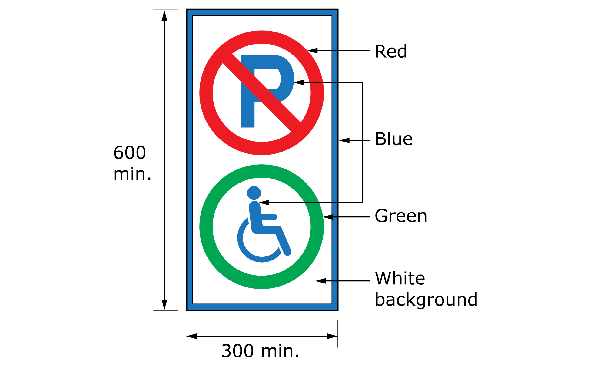
5.2.3.2 Vertically mounted signs
A vertical sign shall:
- be at least 300 mm wide by 450 mm high;
- have the centre of the sign between 1500 and 2000 mm from the ground; and
- incorporate the International Symbol of Access (see Annex C).
5.2.3.3 Pavement signs
A painted sign on the pavement shall:
- be located in the centre of the parking space; and
- have the International Symbol of Access (see Annex C)
- at least 1000 mm long; and
- luminance (colour) contrasted with the background pavement by at least 70% to comply with Clause 6.8.3.
5.2.3.4 Parking sign location
Parking signs shall follow the provisions for signage location in Clause 5.2.2.2.
5.2.4 Enclosed outdoor toilet facilities
For enclosed outdoor toilet facilities (i.e., portable toilets), a washroom identification sign complying with Clause 5.2 shall be mounted on the outside wall of the entrance, where applicable.
If there is insufficient space, then the sign may be mounted in the centre of the door with a centreline at a height of 1500 mm from the ground and the International Symbol of Access (see Annex C) mounted below the sign with a centreline at 1350 mm.